Copywriting 911

Category: Internet Marketing

From the Cold War joke series:
– Mr. President! The communists have painted the moon in red! What shall we do now?
– Well… let’s write “Coca-cola” on it, and that will be the greatest ad in the universe!

To believe this joke, the idea of guerrilla marketing had already existed long before Jay Conrad Levinson introduced it in his much-talked-of book in 1984. In the mid-eighties guerrilla marketing strategies were recommended to small businesses and low-budget campaigns. Time goes by, things change, and today even worldly-known companies do not scruple to use guerrilla ad weapons to create more buzz among their prospects.

This list of ads doesn’t always include my favorite ones: some of them are too cruel, others – almost stupid. But each ad given below is worthy of mention, each of them is brilliant and revolutionary – in its particular category. So, guerrilla ads may be…

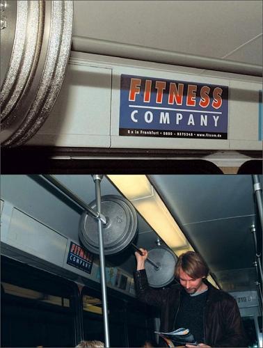
1. Flattering. This ad of sport equipment is great, because it flatters users’ self-esteem. Besides, you can use it to throw dust in the eyes of friends or colleagues: just ask someone to take a photo of you holding that weight, then cut off all unnecessary details like other passengers’ heads – and you’ll have a wonderful picture of yourself starring as Superman.
2. Kind. The best way to dispel fear in your prospects is to provoke it by yourself. That’s why this pothole imitation, looking like an April Fool joke, is very reassuring by nature. You can ask any driver about the matter.


3. Cruel. Looks like a rock star’s nightmare, doesn’t it? The concepts of funny and cruel are inseparable since the Chaplin’s epoch, so this ad of a burn plaster just follows the traditions.

4. Annoying. Maybe, it’s ok in the world of business, but personally I hate the idea of using historical monuments for selling purposes. Despite the company’s name on the ad, something still should remain virgin, even in that notorious business world where nothing is sacred.

5. Persuasive. “The faster you get, the faster you go.” The number of accidents might minimize greatly if a control panel like this was integrated in each vehicle.

6. Creative. This one, in addition, must be inexpensive.

7. Terrifying. First I wanted to place here the Kill Bill banners, but then I came across another “coming soon” ad – that’s really thrilling, if you look closer.

8. Green-Peace-style. Perhaps that ad will please those who really care for animals: so much food for a poor city shark excluded from its habitat!

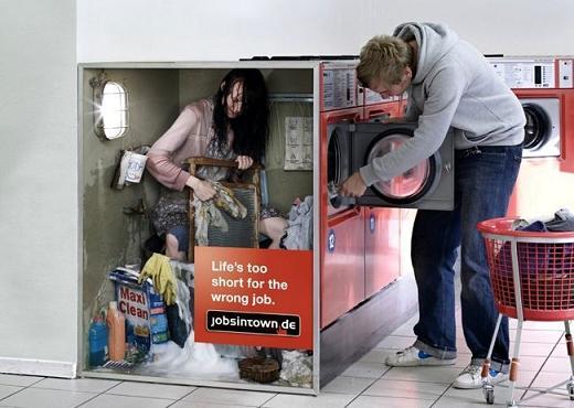
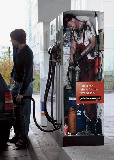
9. Motivating. “Life’s too short for the wrong job.” Make sure you are happy with yours while reading this.
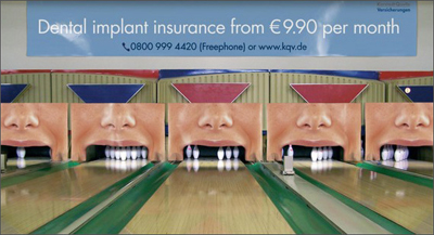
10. Oxymoron-like, i.e. contradictory. It may look conservative, but I strongly believe that ads should have a positive effect on human mind, and this one makes an unpleasant impression, despite its ultimate creativity. Looking at it, I want neither to play bowling nor to open my mouth ever again, let alone to address some dental insurance company. Very frustrating, not funny!
11. Just brilliant! Some of them don’t need comments. Simply see and enjoy:
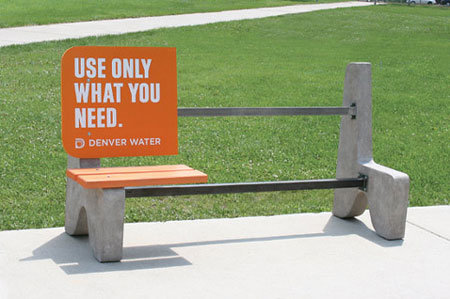
Some ads by quierosercreativo


Copywriting 911 Featured On Ezine
Writing website’s privacy policy or terms and conditions may seem a hopeless task, as:

a) few people really enjoy describing legal issues, and
b) even fewer people read such stuff of their own free will.

Nevertheless, both pages make an essential part of any website, so, if you have one and are interested in its progress, take time to write relevant terms and policy – or hire someone who will do it for you.

Here I’d like to answer the most common questions about Terms and Privacy Policy writing.

WHAT?

Privacy Policy: stands for the way a company collects, stores and uses personal information provided by their customers/visitors. The fact that someone likes your site doesn’t mean that he/she burns with desire to give you the email/credit card number/health history/pet name etc. You should remove all user’s doubts by stating that you won’t disclose the data to third parties, will use it only for business purposes and cherish like the apple of your eye. Here neither paroles of honor nor solemn oaths are necessary – just add the Privacy Policy page to your site, and the visitor will feel safe.

Terms and Conditions: refer to the general website rules covering management and financial implications. By publishing relevant and pithy terms, you inform users about their rights and obligations, outline the company’s client policy and make a commitment.

Both: Privacy Policy and Terms and Conditions are a kind of official agreement between you and the user. As laws differ from country to country, you may carry a certain risk, if the case is brought to court, so keep in mind your international audience while completing these documents.

HOW?

Privacy Policy: this page is meant to reassure users by answering such questions as

  • what personal data you collect (Explain what information you need and why. Avoid requesting unnecessary data, otherwise the user may get not only suspicious of your activities but also very tired before the long form is filled);
  • how it is stored and used (Reassure users that you won’t abuse their personal information and will use it only within limited business ends);
  • how you can guarantee its safety (Clarify how your server and online operations are protected from scammers. Show in details how you ensure security and privacy, for example, [all account information on our website is password-protected]);
  • to whom the data may be disclosed (Be upright while listing parties who will get access to the data);
  • how the user can edit or delete it (Establish your credibility by placing such boxes as [Change User Profile] or [Edit My Personal Information]);
  • the way you inform users about policy changes (Ask users to check back your website periodically for updates);
  • who to contact with questions about privacy (Make it clear that you are always ready to answer visitors’ questions and to help them, if necessary).

Terms and Conditions: a standard Terms of Service page may include:

  • definition and interpretation (Clear up what you mean by terms like “Agreement”, “You”, “We”, “Services” etc. This part isn’t a must, but once you decided to write it, stick to official language. Of course, some readers would appreciate if you write something like [Mr. Smith, the Client, hereinafter referred to as “Dude”], but not everyone has a sense of humor, and most people may think you’re unreliable. So try to be as serious as you can);
  • acceptance (Notify users that by accepting the Terms and Conditions they agree to keep the given rules);
  • intellectual property rights (It also makes sense to mention copyright. Though that can’t completely prevent an infringement, such a notification will at least reduce the chances of it);
  • information about website/services it provides/products it sells (Try to put yourself in the user’s shoes and answer all possible questions that he/she may have);
  • terms of delivery/payment etc (See the previous tip);
  • warranties (If you sell something via your website, inform the user that the product/service fits to the stated purpose, doesn’t infringe the rights of other parties, and that you (the seller) have the full rights to it. Don’t forget about the disclaimer emphasizing that you aren’t responsible for any circumstances beyond your control);
  • limitation of liability (That’s a critically important part, as, being neglected, it can result in a real headache. Explain very precisely which obligations to the user you fulfill, and which you don’t);
  • third parties (Remind the user that only those who accepted the present Terms can take advantage of whatever your website offers. Actually that’s quite obvious for most people, however, lawyers think this part is indispensable, so let it be);
  • notices and contacts (Once again show that you are available to answer any question or remark);
  • and any other issue that you consider important.

Both: well, let’s talk about more pleasant things, like KISS. Not trivial kisses at lowercase characters, but the great and effective KISS principle: Keep It Short & Simple. That means: when you use a formal language, don’t overdo it. Give your Terms and Policy to a friend (hereinabove referred as “Third party”) and ask whether they are at least half-understandable (unless your friend is a qualified lawyer).

WHERE?

Where to place links to these pages? Most often Terms and Conditions’ and Privacy Policy’s links are situated on the bottom of the home page, yet some webmasters prefer them to figure on the site bar or even at the top.

Where to find more information considering legal acts? You can visit the SBA official website to underpin the legal ground for your copywriting building.

Now let me solemnly inform you that this article is protected by all existing laws, can’t be copied, and fits to the standards of professional copywriting. We guarantee the protection of your personal data, in case you want to leave a comment or to submit a feedback here.

Do you like psychological tests? I bet you do. Even if sometimes the tasks seem completely stupid and the results evidently far-fetched, psychological tests or surveys remain a popular entertainment for many people. So, you might like to pass yet another one:

The Implicit Association Test

When you see/hear the word traffic what association do you have?

a) you visualize a busy street in a rush hour, taxis beeping, pedestrians hurrying to cross the street at the red lights, and your poor car standing in a jam;

b) you can’t but think that the stuff will be supplied tomorrow and you should keep it on the low;

c) the only thing that bothers you is your website and its unbelievably low traffic.

Traffic should be:

a) calm;

b) clandestine;

c) the higher the better.

Now check out the results.

All the chosen points are a): you may be a driver.

In your answers b) prevailed: you may be a drug dealer.

You’ve selected only c): the easiest one – you are a website owner.

You’ve spent restless nights creating a unique competitive site, you’ve worn white and black hats in turn or both at once, yet everything seems to be in vain. That nasty traffic doesn’t want to flow. It prefers to stream around your site making your life a misery, coming as a nightmare when you’re asleep and as low SERP ratings when you are awake. Hey, here is a little consolation prize for you, don’t give up! Try these

11 Steps to Increase Your Traffic

At least you’ll know you’ve tried 😉

1. Squeeze all you can out of on-page optimization. Choose a memorable (non-hyphenated-?) domain name, use carefully selected (long-tailed) keywords, optimize the title and meta description tags, create unique and useful content and see that it is regularly updated… Improve navigation; pretty sure not all of your site visitors will be PhD’s, so make it as clear as possible. Try and check that the code is clean and not more than 100K.

2. Try and submit your content to the main directories, like Yahoo and DMOZ.org, as well as to niche ones. Article directories could also bring some visitors (check out EzineArticles.com, ArticleFinders.com or GoArticles.com). Note: The copy should be really useful and unique. If you have an ebook, submit it to corresponding directories, e. g. EbookJungle.com, FreeEbooks.net and EbookPalace.com.

3. Get inbound links. Actually, link building is a topic which can be discussed for hours, so, let’s look at some of its strategies:

– Invite other website owners to publish your articles with links to your site;

– Leave testimonials and comments (but be helpful);

-Answer people’s questions at AdSense Help discussion group and Yahoo answers, placing a link to your site at the bottom;

* Some web masters also don’t scruple to buy text links, nevertheless, Google frowns upon this, so one should be very careful.

4. Hang out in the blogosphere. Take part in blog discussions providing relevant and thoughtful comments. The quality of your posts is critical, as nowadays many blogs are full of spammy silly comments the only purpose of which is to leave the author’s URL. Do stand out of that crowd: create original and pithy posts. Set up your own blog, leaving such tags as “Digg this” or “Add this to del.icio.us” below each article. Some social networking sites have amazingly massive traffic and, once your content is original, you gain visitors automatically.

5. Publish useful posts in forums, using keywords for your online profile. Growing forums often need additional moderators. Offer your services in exchange for free ads of your site.

6. Create your own forum as well if you can, yet consider a few points first. Someone has to moderate the forum in different time zones, 365 days a year, removing spam and managing its work. So, you’ll need several reliable moderators ready to share your trouble. Launching a forum, it’s very important to remember that this is just a helpful tool for your website’s promotion. In other words, make sure your visitors pass from forum discussion to the site itself, otherwise this plan won’t do.

7. Distribute a captivating informative newsletter for encouraging repeat traffic. Tell your readers about new and the most popular articles, offer them to take part in the survey you’re running, arrange some interesting contest and give away freebies. Ensure that the charm of novelty never fades, and your repeat traffic will boost. After all, why spend time and force on flirting with SEO, if the visitors forget about your site as soon as they leave it?

8. Don’t forget the power of well-written press-releases. “Well-written” means pithy, compendious and gripping. Grab the readers’ attention with a killer headline and some hot topic being discussed. Once an effective press-release is ready, submit it to BusinessWire, PRWeb, PR Newswire and other press release distribution sites.

9. Use PPC advertising. The treacherous aspect of good content is that you risk losing money instead of earning it. Thus, if your pages feature brilliant content, it may distract visitors from sponsored ads. The fact is that, if you pay for traffic, your content should also be persuasive. To increase the conversion rate create landing pages dedicated only to publicity. Attract people’s attention to the product/service you promote and make them fill out the sign-up form. Many website owners buy pay-per-click advertising on Google’s AdWords or Yahoo! Search Marketing, but these tools can be helpful only if your site’s conversion rate is rather high, otherwise it’s quite unprofitable.

10. Make your content available through RSS. Providing a content syndication feed with a link to your site will help surfers to find you in the endless Web ocean.

11. Apply for a consultation of professional SEOs and let them draw you a checklist of things to be improved/changed/implemented.

All in all, make sure you’ve taken your website promotion seriously – and you’re likely to soon be getting real serious traffic.

Any PR? Yes, please!

November 9th, 2007

If you shudder every time someone asks to please pass them the juice over the dinner table, consider visiting the GP. You might be showing the symptoms of a serious disease that has been spreading around quickly.

The name of this ailment is B.O., also known as backlink obsession.

Since the advent of Google with its revolutionary Page Rank system, people who have been overusing its carriers, links, experience various acute conditions, feel unquenchable thirst for new links and sometimes even act inadequately forgetting about all the rest of daily concerns.

So why are links so addictive?

These days every SEO is born with the knowledge that the quality and quantity of inbound links to your site are the major variables in your success equation. It is the link flow that gives you the power of an authority, and the authority in turn brings you visitors, conversions and money in packs. As a result, webmasters often look forward to the quarterly Google dance as if it were the first ball for a young lady to come out into society, determining her future “career” as a bride. And then – oh, Heaven, the 3 month delay, and Matt Cutts says they simply forgot about the update.

If your heart skips a beat at reading this, too, it might be a good idea to have a look at the following 5 common facts about PR which we’ve marked as True or False.

1) Page Rank is a value that shows how popular your site is.False
PR only refers to a certain page within your site, and so when you need to direct the juice flow to it, do state the exact url of your landing page (e.g. links to http://copywriting911.com will be of no value for the PR of http://www.copywriting911.com). However, internal linking may help pass some energy around your site as well, so links from a PR5 homepage for example could translate into PR4′s for second level pages.

2) High Page Rank automatically brings you to the top of SERPs.False
If you look at the 1st page of search results, you’ll see that sites with lower PR sometimes rank higher than their competitors with “greener” PR display. It is so while PR is the last one of ranging factors which becomes decisive only when the rest of parameters coincide. Before launching your hunt for PR, make sure you’ve done the on-page optimization, including the keyword research, content creation (!) and overall site structuring.

3) The more links point to your site, the better for its Page Rank.False
Hundreds of backlinks from spammy directories will not help you promote a resource though they won’t probably hurt you, either. While it is theoretically impossible to control who links to you, there’s such a notion as “bad” or “good” neighborhood. When you’re looking for linking partners, better choose those who wear white hats. Don’t make Big Daddy suspicious.

4) Paid links are evil for your site.True. And False.
To tell the truth, this issue is a controversial one. Recently there’s been much fuss about devaluating sites that trade links via TLA. However, TLA itself seemed to stand up to the update without any losses, just like a number of splogs and scraper sites monetized with Google Adsense/Adwords. And yeah, do you know that the second largest SE, Yahoo, actually allows buying and selling links?
Though we can’t decide for you here, if you still choose to try, at least make all you can to ensure your paid links look natural.

5) Network interlinking will not help improve your Page Rank. True and False again.
There are two main types of networks: ones owned by a single person or a group of individuals and hosted on the same server with identical IP C classes – and these are really a waste of your time in terms of SEO; and secondly, niche communities connected through business ties and spreading valuable editorial links (b5media), which is perfectly ok with Google, as that’s a part of standard commercial promotion. One more thing to take note of, reciprocal links are yesterday’s hit. They hardly rock any longer. They are so likely to be forgotten tomorrow.

That was it. At least now you know what direction to move in. Hope this dose of anti-B.O. vaccine relieved your pains for a while, and should you need a professional consultation on SEO, we are here to help! Please also feel free to comment with more ideas about Page Rank importance, and we’ll reply.

P.S. Content is king!

Want to have an ideal body? / Tired of nasty humming mosquitoes in your bedroom? / Fancy building a site you can be truly proud of without much fuss?

Use our unique remedy and solve all of your problems once and for all!

Just ask yourself: how often do you think something like “If only I had [the body which was good enough not to be ashamed to undress on the beach /a big and effective mosquito trap to get rid of all those unfriendly biting creatures / good experience and knowledge to get more traffic and links to my site…]“? People spend years waiting for a miracle to come, but now it’s time to cast aside all your hesitation and fears and to get what you really deserve. The unique first-rate [weight loss pills / mosquito super-catcher / e-book on the Internet marketing] will help you to achieve the desired effect quickly and efficiently! Using our fantastic [“Anti-Glutton” pills / mosquito mega-killer “No Stinger, No Cry” / detailed manual “1,000 + 1 pieces of advice for successful website promotion”] you will forget endless hard days you had to know and will be able to enjoy your life in full!

Order right now and get 25% discount!

Need more details? Just look and see how it works!

Thanks to the use of innovative technologies and the latest know-hows in the field, our product contains the full range of qualities, focusing on the most pressing needs of our customers. You can keep on [eating chocolate cakes and jellyfish for supper / opening windows without turning off the light in the evening / running your online business], while our genuine [calories burning formula / device with improved design and special anti-mosquito covering / collection of helpful tips from the leading experts in online marketing] works for you, bringing an effective and prompt solution!

Want some proof? Listen to what Rosa X from N says:

“I used to be so [stout / tired of those disgusting insects / unaware of modern SEO technologies], that there was almost no hope to change it for the better. I’d already got accustomed to the idea that [I had to forget about fashionable miniskirts / I had to spend a fortune on anti-sting sprays / my site would remain outside the Big Business] for the rest of my life, when one fine day my close friend advised me to try [the name of the product] and I was truly amazed how it helped me! Now [my body looks so slender and harmonious / my sleep is sound / my website has become an authoritative leader in the niche] and I know it’s for good! Thanks!”

Isn’t it exciting experience? Buy our unique product NOW and save your precious time and money, as today we offer fantastic discounts:

Place an order within 5 days and get 5% discount!
Place an order within 3 days and get 10% discount!
Enroll right now and get 25% cut off the price! That means you get 1/4th absolutely FREE!

Good news is that it’s REALLY easy to join us! All you have to do is to take the following two steps – and you’ll get this fabulous opportunity! So, go ahead, just do it and enjoy every minute of your life!

Because you really deserve it, don’t you?

P.S. Now you know how to [lose pounds without dieting / get rid of buzzing mosquitoes in your bedroom / attract targeted traffic to your site and conquer the top positions at SERPs] and save 25% of the current price to treat yourself to [dough-nuts filled with custard / night-light with scented candles / renewed website design]. However, you need to hurry: the attractive price offer ends on [July, 31st]!

14 days left!

P.P.S. You can use this matchless thrilling sales letter sample absolutely for FREE by putting the name of your product and some specific details into the brackets.

P.P.P.S. Need more SEO samples? Use professional copywriting services from our SEO experts!

If people intend to buy, do they really buy? Seems to be a stupid question to ask? However, experienced e-commerce insiders know there is a BIG difference between people’s intention and the direct action of buying. The problem becomes more obvious when studying shopping cart experiences. Thus, to believe the statistics, about 75% of shopping cart transactions remain uncompleted. Although websites’ owners do their best to make their products or services look more attractive as well as to optimize the pages so that they can be easily found, a potential customer can visit a site, choose some items, add them to the shopping cart and… leave.

What are the barriers to effective online selling?

It’s not a secret that the usability of some e-commerce websites still leaves much to be desired, and this is the first thing to be attended. Thus, in e-shops with structure more complex than 1 sub-level deep, the navigation can be simplified using headlines, sub-headers and breadcrumbs.

Secondly, the need to register before adding products to the shopping cart may annoy a lot of prospects. As is known, the driving force of purchasing is emotions, not logic, so lengthy procedures on the way to checkout often make shopping enthusiasm disappear as fast as it arises.

Other possible reasons for shopping cart abandonment are the absence of visual feedback when the selected product is moved to the cart; the use of the Buy button instead of the Add To Cart one; endless written instructions as to updating the cart’s contents; and the requirements to enter customer’s personal information before letting them know the overall costs.

Can the shopping cart abandonment rate be diminished at all, and how?

Fortunately, yes, it can. Any e-commerce shopping cart can be improved considerably by using the following notes, resulting in higher business income.

1.The latest studies have proved that a thumbnail image of product contributes much to the shopping cart completion. A picture gives an additional opportunity to view the product and helps a potential buyer to visualize possession. In other words, make people SEE themselves buying. Besides, by placing the product’s image in the site, you care of those customers who aren’t native *English* speakers, and be sure that they will appreciate it greatly!

2.The log-in and registration requirements shouldn’t be too sophisticated – don’t tire out your visitors. They DO WANT to buy your stuff, so just let them do it without imposing endless exhausting fill-in forms.

3.Make sure that a client can easily add, remove or change items in the shopping cart, especially if products come in various sizes, colors and styles.

4.Also you’d better be certain that all the articles shown are in stock, otherwise a customer may feel frustrated (and not without purpose) and never visit your website again.

5.Caring for user’s convenience, include links back to the page with product’s catalog number. This simple operation can be very helpful for customers, and their gratitude may bring you larger profit.

6.To increase the completion rate, provide several payment options. Nowadays different serviceable payment systems, like PayPal or WebMoney, are available. Many people prefer to use credit cards but don’t burn with desire to provide their numbers over the Web. Supply your clients with such options as fax or voice payment and arrange that the company’s contact information is always reachable.

7.Another proficient method to win your customer’s confidence is to offer a guarantee. Even if someone will try to cheat you, the total income should increase greatly.

8.Finally, if you want to be the most pleasant online trader to deal with, let a visitor know all additional charges, like shipping and handling beforehand. Of course, you shouldn’t shout about that, inform your customers very softly, but frankly – and they are more likely to buy than if they stayed unaware.

9.Did you like these tips? And would they seem so easy-to-use without being numbered? So, make each step of shopping cart completion as clear as possible. Include the Next step or Continue with Checkout button on every page. The crucial point is that the button should be placed far from Remove from Chart to avoid wrong clicking.

At last, don’t forget about the importance of your e-commerce site’s content. Is it really attractive and motivating? Anyway, you can always improve it using professional copywriting services.